
Appeal To Tradition
Utah Chronicle Newspaper Rebrand
FOR: Daily Utah Chronicle (Student Media)
BY: Student Media Marketing
MY ROLE: Art Director, Designer
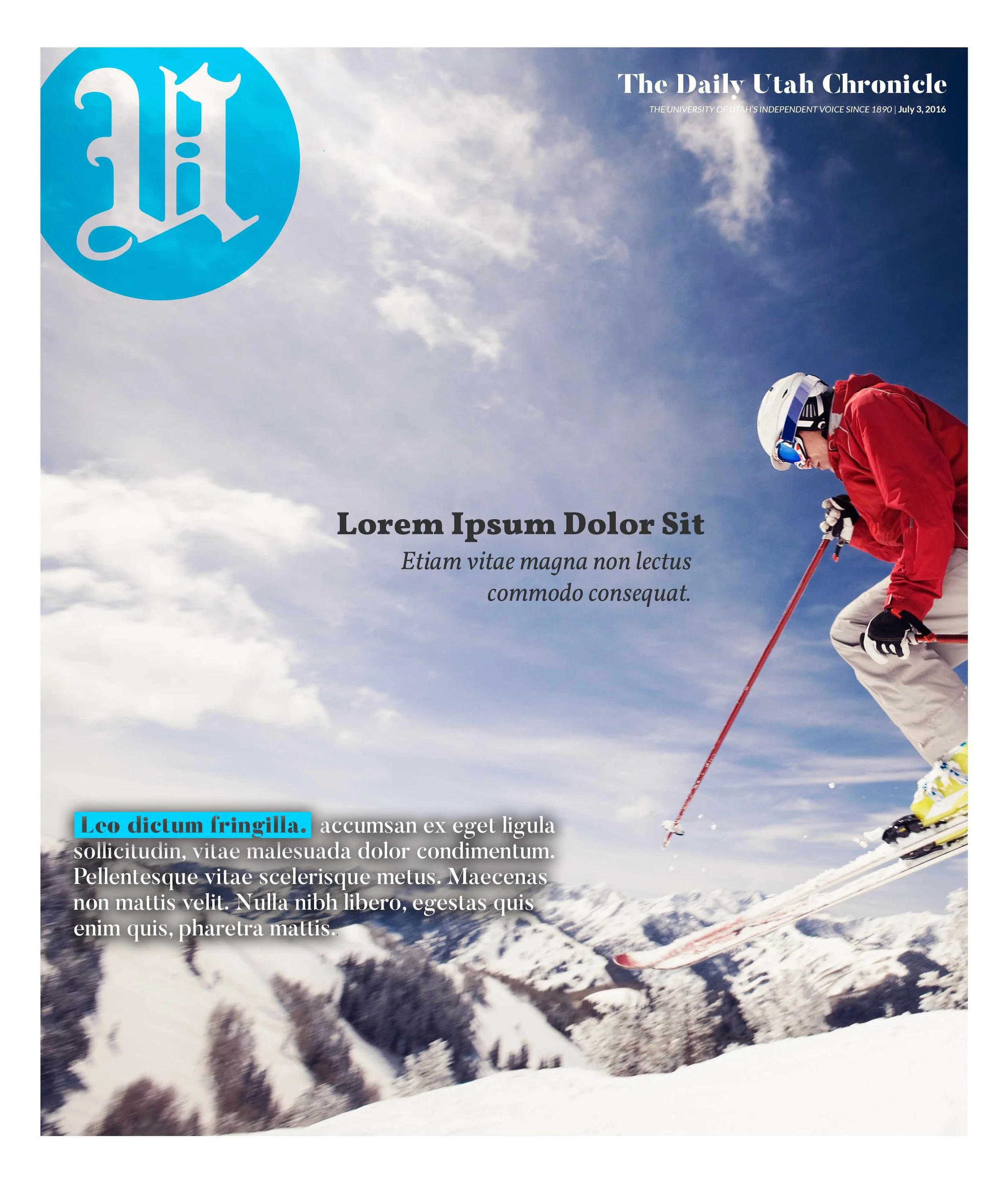
PLACEMENT: CURRENT BRAND OF UTAH CHRONICLE

Something That Lasts
The Daily Utah Chronicle—the University of Utah’s student paper—was going through some changes in 2016. To be honest, what newspaper wasn’t?
A push digital was already here and had set up camp. The desire for clean, fast content was unmatched.
At the time, the Chronicle had a totally scattered identity, with three logo iterations in the last 5 years.
Working as a graphic designer at Student Media, I took a stab at creating a mark with some staying power. I looked to respectable, ageless masthead titans, like the Times, the Tribune, the Post.
One stylistic thing in common: old english.

The Utah Chronicle is pretty damn old, with a lot of neat history and past printed issues containing some very distinctive old English mastheads.
The old english “U” seen on the masthead of the Chronicle is a mixture of two different mastheads used throughout the 1960s.
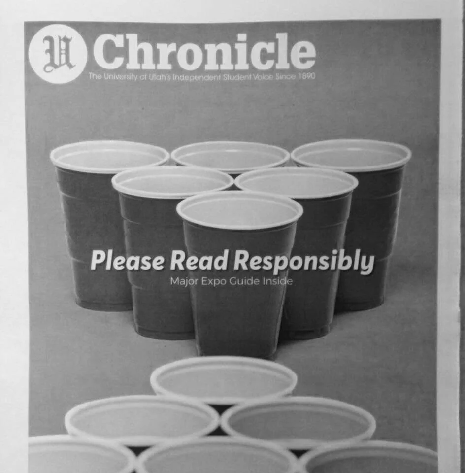
COVER DESIGNS


ARTICLE WITH FULL IMAGE SPREAD

PRESS PASS AND BUSINESS CARDS


Ultimately…
I created a style guide for the whole organization, including print layouts, web design, social media identity and more.
The project bounced around for two years, then in 2018 creative direction over the paper changed hands, and the idea was finally adopted. The Utah Chronicle still rocks the logo to this day.


TYPOGRAPHIC HYPE FILM — RICE-ECCLES STADIUM
AMBITIOUS WOMEN’S BINGO ACTIVATION — WALL STREET JOURNAL
WE ARE WARRIORS SEASON CAMPAIGN — UTAH GYMNASTICS
INFLUENCER MERCHANDISE LINE — NEVER FOLD
RE-LAUNCH CAMPAIGN PITCH — HIBALL ENERGY
BILLBOARD TRUCK DESIGN — UTAH FOOTBALL
SCHOOL NEWSPAPER REBRAND — DAILY UTAH CHRONICLE
POSTER SERIES CAMPAIGN — SONO SUSHI EXPRESS
PSA FILM — HOW WE DIE ORGANIZATION
UMOJI STICKER KEYBOARD — UNIVERSITY OF UTAH